Previously participated in an crowdfunding activity by an unknown manufacturer, which was originally intended for small companies. However, it did not grab the millet bracelet 2, compared with the discovery that the Cling smart watch has roughly the same function (known as able to monitor the number of steps, sleep, heart rate, skin temperature, positioning and notification synchronization), and also brought a larger screen, so 199 price action missed.
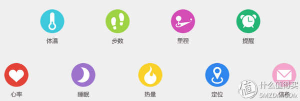
After experiencing the experience, I felt the sensation of this type of small-scale workshop products that started from the crowds... The gap between the cost-effectiveness and the actual experience of the smart product hardware.
Slightly cheaper to open the box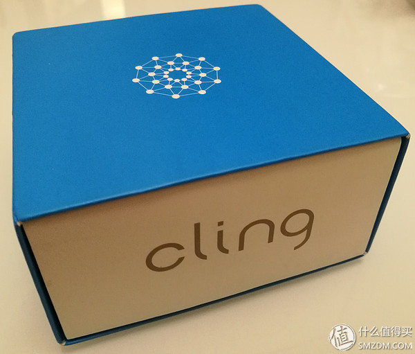
From the perspective of packaging, the logo of the manufacturer (Hanlin Technology) still has a sense of technology.
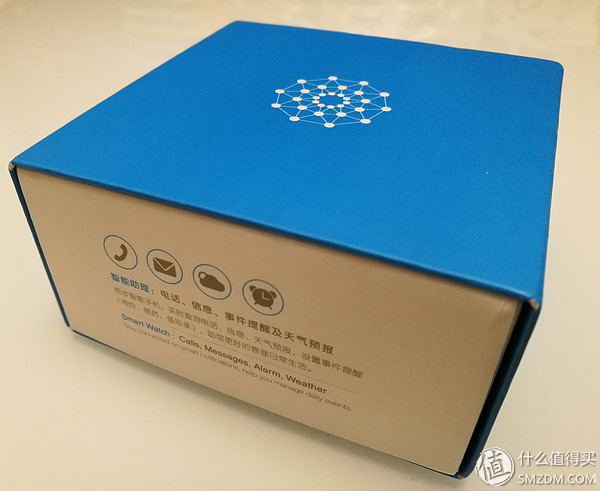
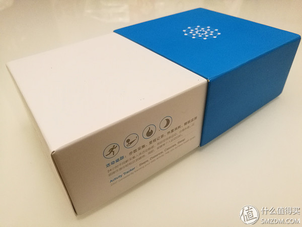
Pull-out box design, in addition to the Logo, there are eight major features of the icon.
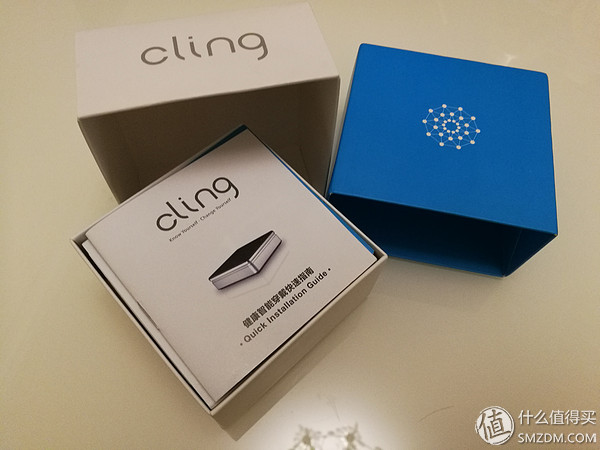
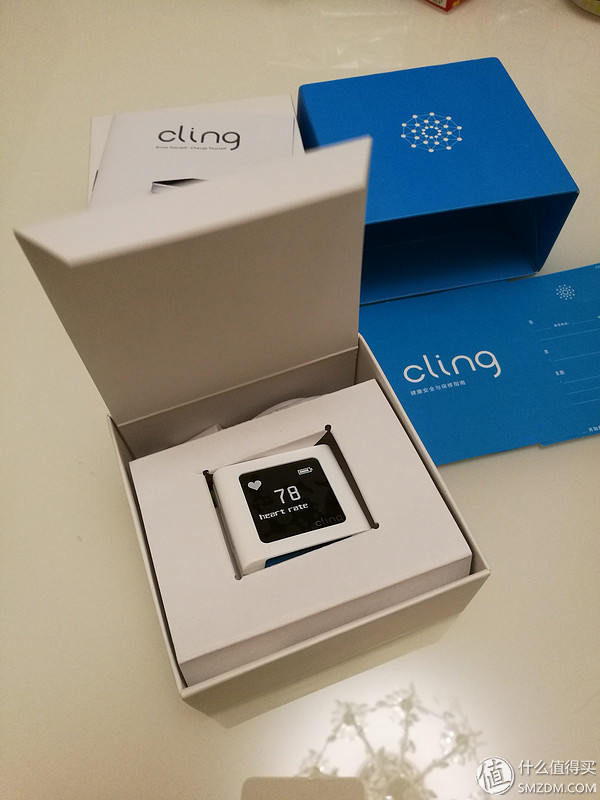
Open the inner box and the body card is in the middle position. At first, it was thought that the advertising figure was deceiving. What a big circle of watches... It was discovered that it was a charging base. The charging cable is stored in the mezzanine and the wristband is on the bottom. The specification of God's horse is ignored...
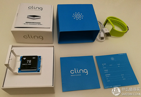
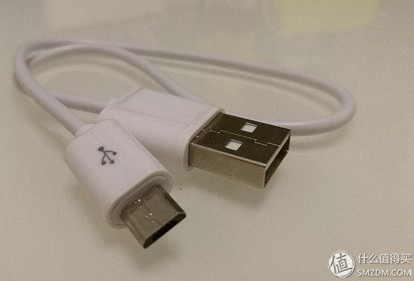
The charging cable is MicroUSB interface, do not worry about the original wiring is too short. On the contrary, there is little worry in the wrist...
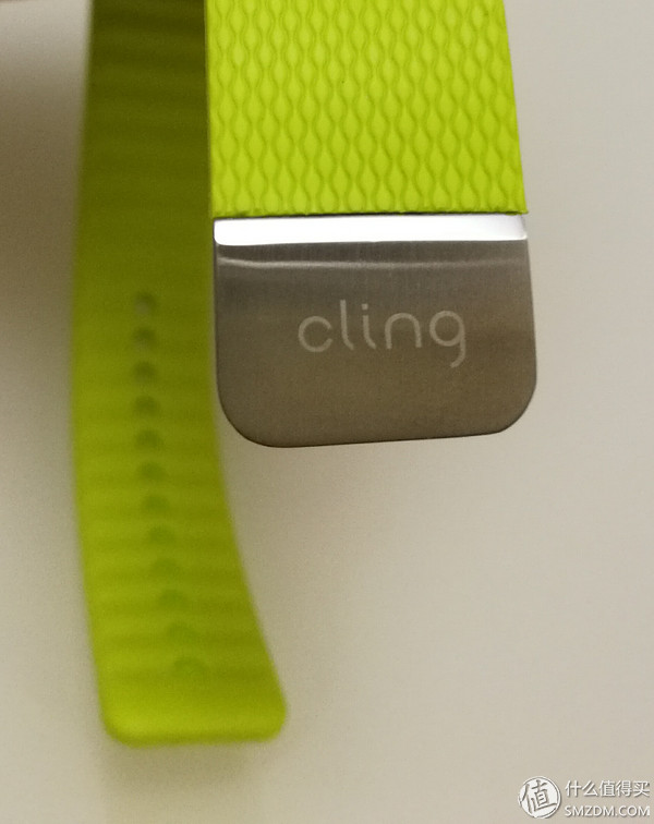
The “Cling†logo on the buckle position, then! This clip is slightly simpler, with only two clips and no strap/buckle design.
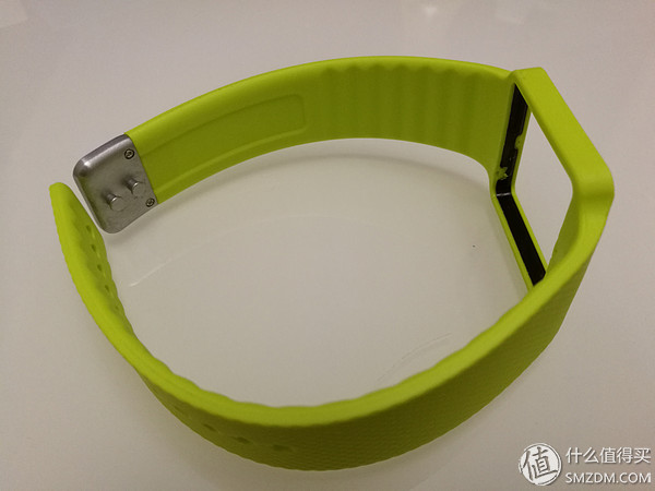
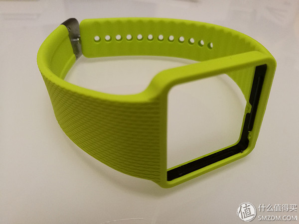
The fixation of the body and the wristband is also in the form of a buckle, and the internal measurement can be seen to be a bayonet. This part of the body can feel firmness.
Charging the base part, the work is a bit like a toy, relatively simple (陋 既 既 既 既 既 既 既 既 既 既 既 既 既 既 既 既 既 既 既 既 既 既 既 既 既 既 既 既 既 既 既 , , ,
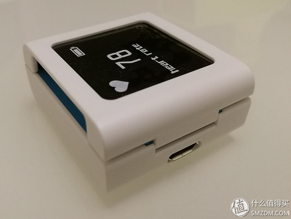
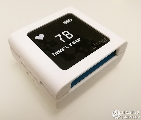
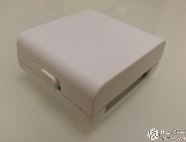
The other side is a snap switch, or reveals a toy atmosphere...
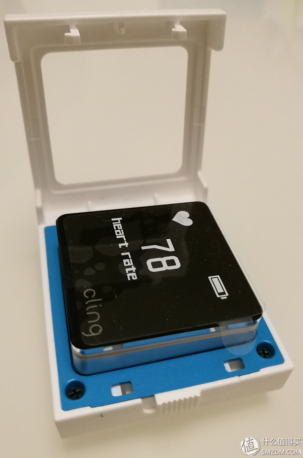
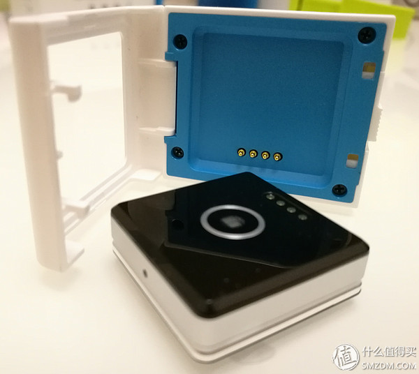
Unlock the imprisonment! The dial and charging cradle use common pin contacts to charge (in the beginning it was thought to be a wireless charging on tall...).
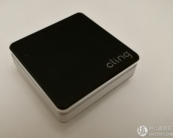
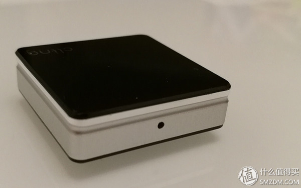
The dial body is also simple, with a logo underneath the front display, no physical buttons, and a small reset hole at the top, but personally feels more like a reboot... it doesn’t feel like the data is being reset several times after poking...
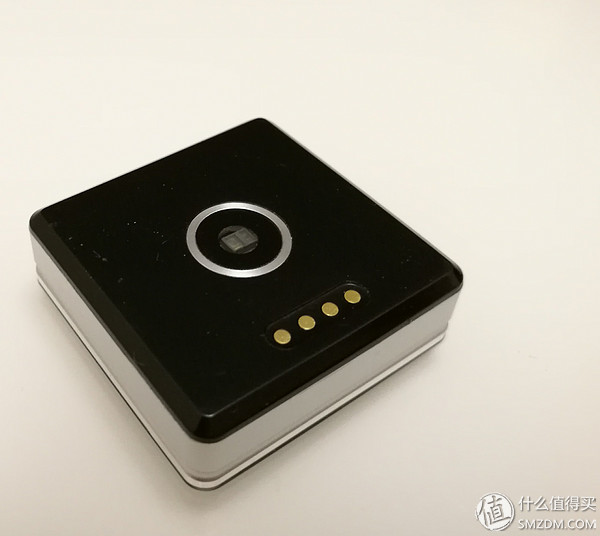
The back has just seen it, the middle square position is the optical heart rate, and it is said that the silver metal ring is used for body temperature measurement. Four metal dots are charging interfaces.
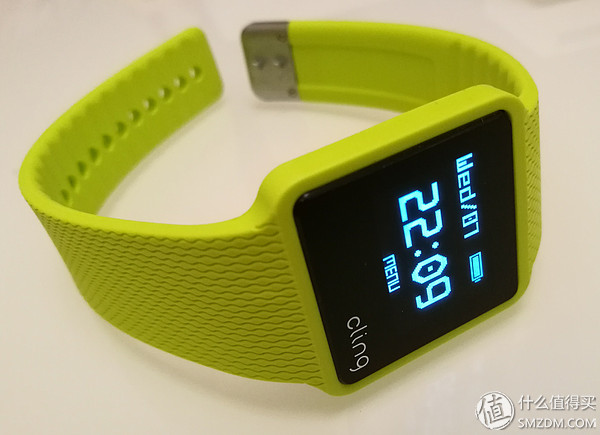
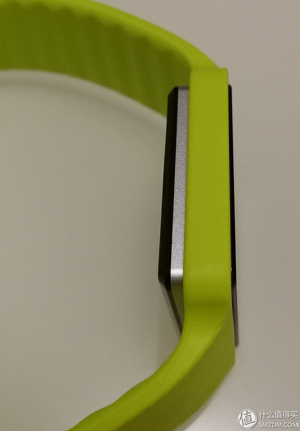
After fitting with the strap, it is fixed by the buckle. In order to get close to the skin, the bottom of the dial is prominent.
Application experience to be improvedKnown as step counting, heart rate monitoring, temperature and other major functions (it was also attracted by a hodgepodge-like function ...), comes with the display is also easy to view, are through the form of scrolling left and right screen display, scroll up and down is to view Recorded in different time periods. Let's take a look at the presentation of various functions (unexpectedly, there are even weather forecasts...):
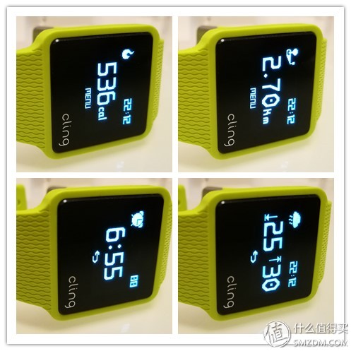
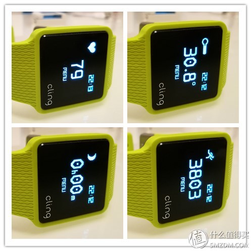
The function is there, not allowed to wait for the test of time ... ... Then the application of the docking, but also feel the need for manufacturers to increase the bar ...
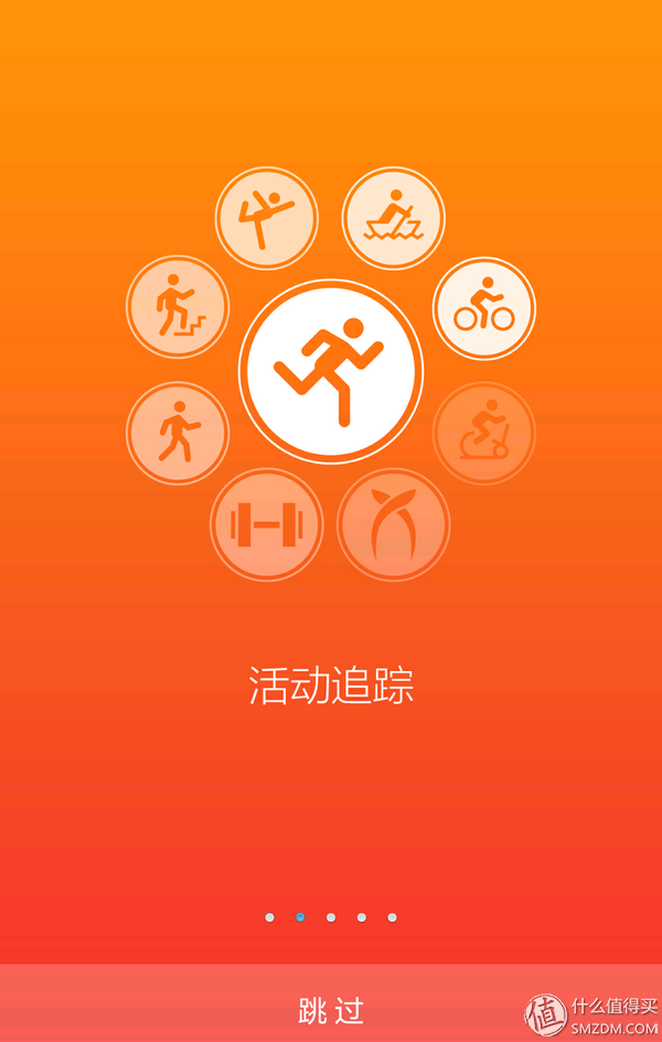
First of all, Tucao... Every time you start the application, you have to go through this scrolling page again. Although there is a skip function, you always experience a discount on the details.
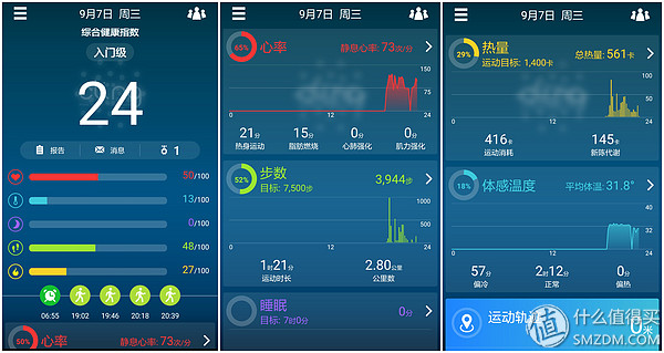
After entering the application, it is a common parameter monitoring page. Somewhat similar to Microsoft's health applications, all parameters are in card form, scrolling down to view. Because the sensors and functions are more complex, the data is still relatively clear.
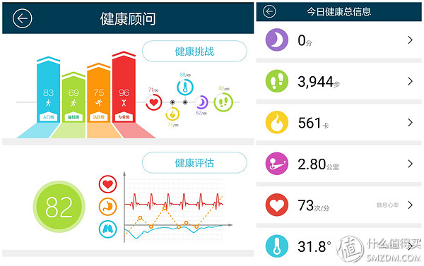
For the collected data, there is also a report analysis function, but it is more like a simple summary page than Microsoft Health... It does not combine personal data to give future fitness plans and guidelines.
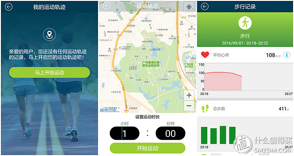
The more commonly used running monitoring requires manual switching, which is more conventional in function, and integrates data records of map trajectories and subdivision periods.
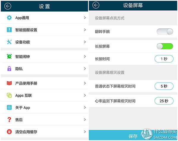
On the application side, the functions are arranged in detail, and there are items that can be customized from the application to the device. Unfortunately, the watch does not have an integrated skill system. The function of docking with a mobile phone is relatively simple, with only telephone and information notification.
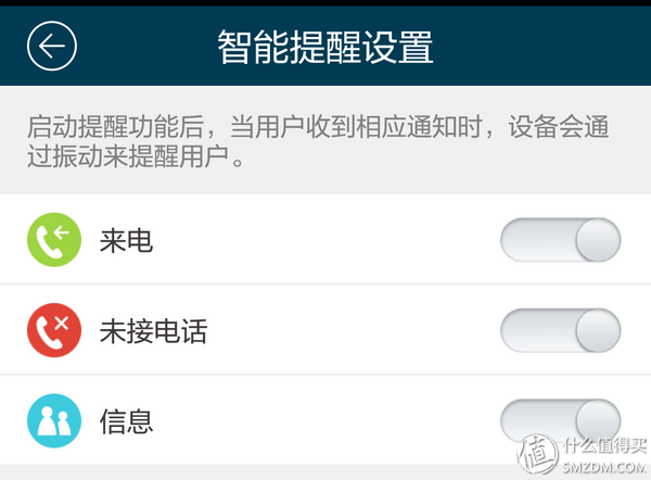
From a functional point of view, the Cling smart watch is regarded as realizing the function on the advertisement. However, if the user experiences poor performance, it is only the function that is achieved. There are many details of the optimization that can be expected.
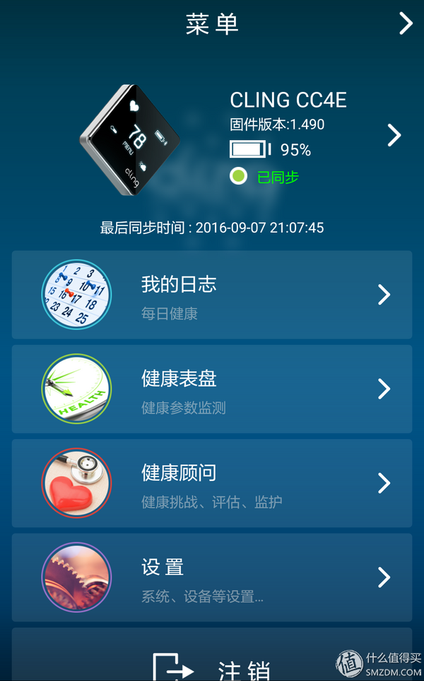
From the hardware side, the dial touch experience is jerky, and it can be switched to another screen after several slides. Secondly, it seems that the interaction has not yet been completed. For example, if you switch to the middle screen function, you can only go back to the default time screen and you can only roll back. There is no global home page operation. From the application point of view, the poor experience of the sliding operation has been extended... Each time the page is switched, the card is felt, and the color matching is also a little messy. The overall design reveals a touch of small workshop sense. The second is that the planning of the application function is somewhat confusing. Some data pages are repeatedly presented and the functions can be integrated and separated. There is also a social aspect, and there seems to be a problem with the WeChat interface, and it does not see stepped data synchronization.
Overall, if you want to collect data, Cling smart watches are considered cost-effective. It may be that there is more integration of functions, and the appearance of the dial and the application end all reveal an unfinished feeling...
Trolley Speakers,Bluetooth Speakers,Dj Trolley Speaker,Trolley Speaker System
Newmax Electronics Co.,LTD , https://www.fspeaker.com